
How does everyone feel about the warm colours, whites and neutrals that are gaining in popularity? I love warmer tones as they are comforting and gentle on the eye. However, I know some people are mystified that terracotta has made a comeback and that blush and apricot tones are now in vogue again. If this is all too much for you, but you do want to explore using some warmer tones, then a soft Nude colour palette may be just what you are looking for.
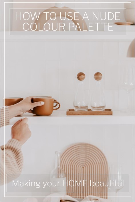
The beauty of a Nude colour palette is that you get the warmth of pink and orange but without the deep and strong colour statement. It's a way of bringing some softness to a scheme which is somewhere between a colour and a white.
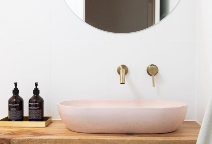
A white bathroom is gorgeous and crisp and of course timeless but they can sometimes look a touch clinical. Some warm timber tones go a long way to addressing this but by adding just a simple basin in a nude natural concrete, you elevate the scheme to another level.
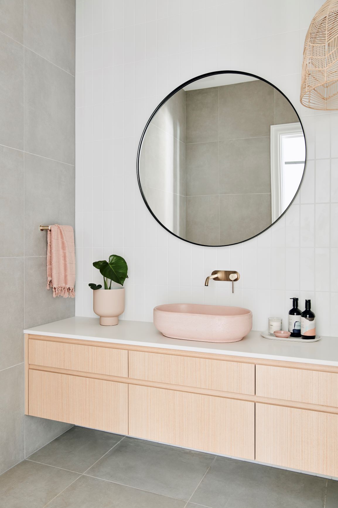
Have you also noticed that tapware is becoming far more adventurous in its colour offerings? For many years, we simply had chrome and more chrome to choose from. Then we started to see a little brass and lots of black on the market and now there is a range of more than a dozen finishes to select from, many that suit this gorgeous nude colour palette.

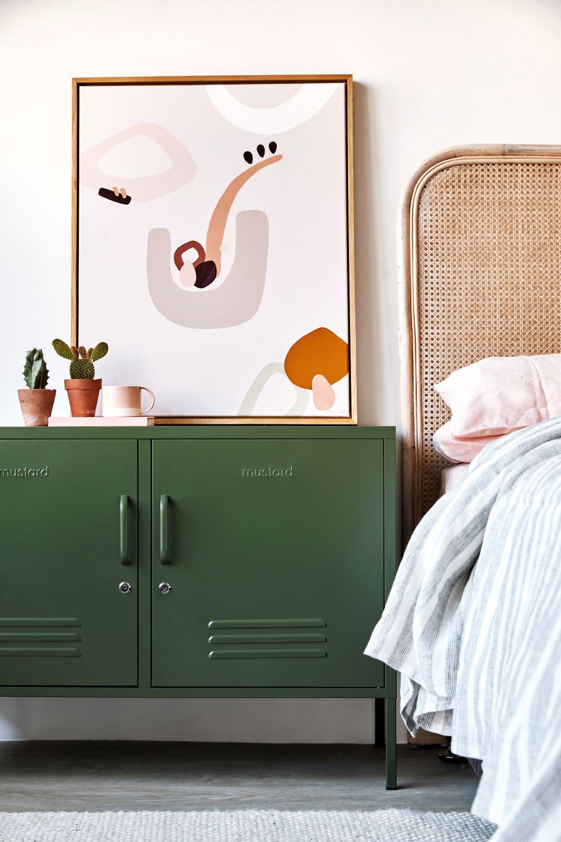
If you love the rattan trend, the odds are that you would also like this colour palette. You can see from the image above that the nude and warmer colour tones that they derive from, fit perfectly with natural rattan. These are the elements that we have been introducing into our interior schemes over the last couple of years in an effort to introduce texture, but also soft natural colour.
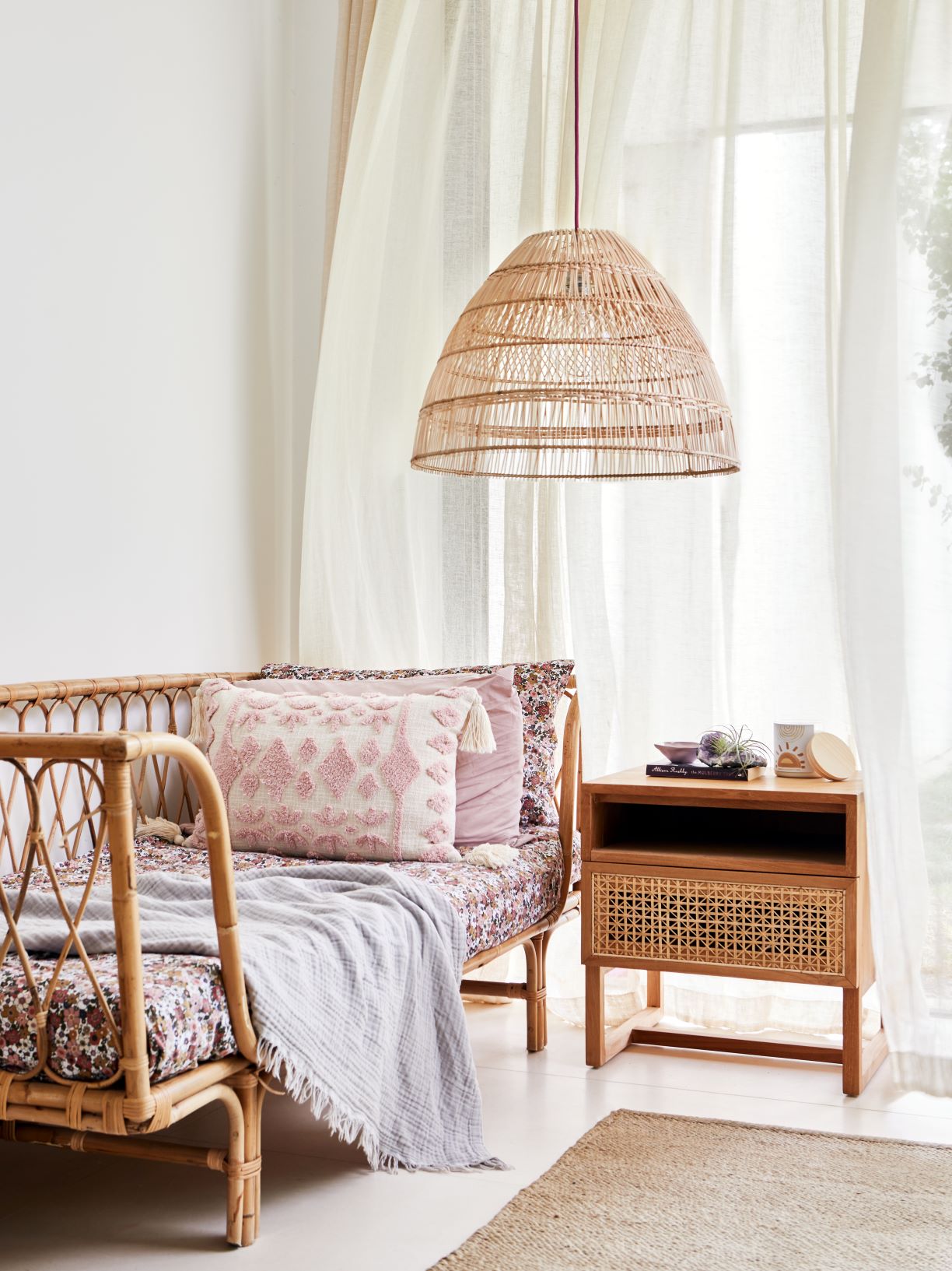
Related: The Rattan Trend – how to introduce it into your home
As lovely as a soft nude colour palette is, I do like to see some contrast in tone and this colour palette above demonstrates how you can use these tones with crisp white, beige, pink and terracotta.
Related: Let me show you how to use Terracotta
A Nude colour palette and it's relationship to beige
A nude colour tends to be slightly more pink than the more traditional tones of a warm yellow beige. However, as they are adjacent on the colour wheel, soft nude tones sit very well with a warm beige and creates a harmonious colour palette. An injection of crisp white prevents the palette from becoming too sugary and sickly.

Related: Decorating with the new beige
Other colours that work with this palette
A Nude colour palette is a very natural one and I love to see it as a backdrop to green, which is its complementary colour. In its very lightest form, a nude tone is almost white.
Don't be afraid to match some warm greys with this type of colour scheme. Soft taupe greys suit a nude colour palette perfectly.
Did you know that I have a Free Resource Library? Whether you are building a new dream home or just undertaking a weekend redecorating project, there will be something there to help and inspire you. You can download the free checklists and e-books here.
Hi Samantha. Can you advise on wood flooring. I have wenge furniture and a plantation look to my small sitting room. I want to get rid of carpets. My instinct is to match the dark furniture because the lighter samples look wrong. Is there an arrival that would help me decide. Love your work. Thank you
Hi Julia I would definitely favour darker flooring with Wenge furniture and a Plantation style look. Sometimes if you have the odd piece of dark furniture you can get away with it, particularly if you also use some rugs, but as you want the Plantation look anyway, it makes sense to have the floors dark. Dark floors define the edges of a room too and really ground the space if you have lighter walls. Hope this helps Samantha
Absolutely stunning, makes me want to start all over again with my style. Sadly I have added a bit of black. How do I incorporate matt black into this style?
Hi Tina glad you love the colour palette! You absolutely can introduce a touch of black. I have written a post about using an accent of black in decorating schemes https://www.makingyourhomebeautiful.com/how-to-use-black-accents-in-interiors/. By adding some matt black into a scheme like this you get some nice strong tonal variation which can look stunning. Hopefully this post will give you the confidence to put your scheme together. Good luck Samantha
Just loving nude colour palettes with rattan at the moment. That light shade from Lighthouse Lane is a STUNNER!
We have duck egg blue window frames, which I love. I’m trying to tie in a neutral living room and I’m stuck with what colour to choose for a sofa without it being too dull and beige. Any ideas please. Thankyou.
Hi Louise have you considered extending the duck egg blue to the sofa? Or you could use one of the neutrals from the room but then add an occasional chair in duck egg blue to lighten things up. Hope this helps Samantha