When you see a simple neutral scheme that you love and would like to replicate, the key is understanding the importance of tonal contrasts in interiors. You often hear derogatory remarks about the colour beige and how boring it can be. This is only true if you use lots of beige that is the same tone. If you use lighter and darker versions of any neutral as the basis for your colour palette, you can create stunning interiors.
I was taught to approach colour palettes as you would if you were to compose a piece of music. Great music has high and low notes with variation and repetition. A piece of music all in high notes or low ones would be unbearable, and this is generally the same as a colour palette.

This colour scheme above highlights the importance of tonal contrasts perfectly. A simple white background on the walls and in the artworks works perfectly to highlight the rich brown of the hat and the strong dark tones of the vase. By mixing up the frames in the artwork and introducing some mid tones with the accessories, the scheme has interest and lots of appeal.
You can of course have all white schemes or all dark schemes which are also very striking, but these in themselves are statement rooms which rely heavily on good architecture and varying textures. If you tried to do the same with a simple beige palette, the effect would be dull and boring. Beige sofa, beige carpet, light beige walls and curtains with mid toned furniture is what has given beige a bad wrap.
In any case, you will see with either all white or all dark schemes that they will invariably have just a touch of tonal contrast.
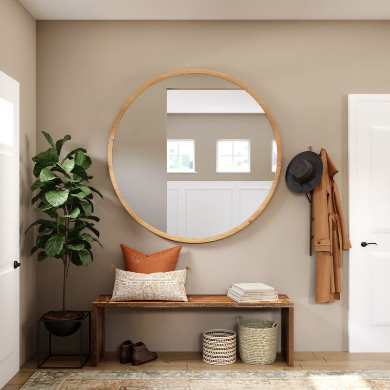
This entry hall above is predominantly in beige tones. This works so well with the strong contrast of white in the doors, windows and panelling. The tan leather cushion and coat are the stars here with the hat and plant pots providing a strong contrast at the other end of the scale. Always consider a colour palette as a scale and to enhance a classic neutral palette, introduce accents from either end. With this background any small colour that you introduce then becomes a lovely focal highlight and the room comes together perfectly.
I have more to tell you about beige in Decorating with the new beige.
The combination of beige and grey makes the much loved and used colour greige. Popular for exteriors and interiors, the grey tones down the warmth of the beige and makes it a very approachable neutral. Again though it must be used with tonal contrasts. Imagine a classic Hamptons style weatherboard home painted in a soft greige without a crisp white trim. It just wouldn't work at all. Or a greige exterior without any contrasts in roof or garage colour. It would just look like a monolith and offer no street appeal.
I have more to tell you about greige in What is Greige? Find out how to use it here.
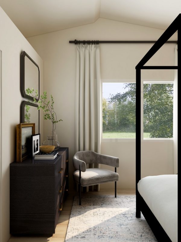
I really love the bedroom above. Remember that scale? There is a gorgeous soft neutral for the walls, curtains and floor with a strong dark accent of black at the other end of the scale. With soft greys in between, the scheme is stunning. It is simple, calming, but still has lots of interest. This is the benefit of introducing tonal contrasts into your scheme.
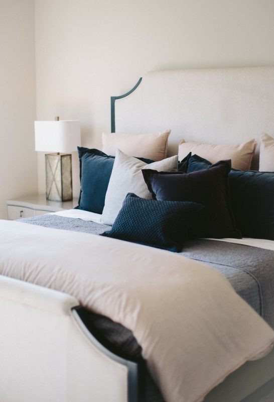
This is another example which has introduced very dark blue as the strong tonal contrast, with off white and a soft grey from the middle of the scale. Even just a couple of these pillows, with the small injection of black in the bedhead, would have been enough to ensure the success of the scheme.
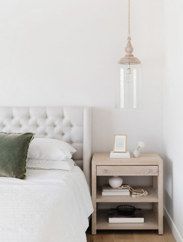
Don't feel that you need to introduce a very dark accent. If you like the idea of a light and airy scheme, it is just enough to have light and mid tones together. The timber accents and the green cushions are enough to create a tonal contrast. This scheme also benefits from the buttoned bedhead which adds texture and design and prevents an all white scheme from being flat.
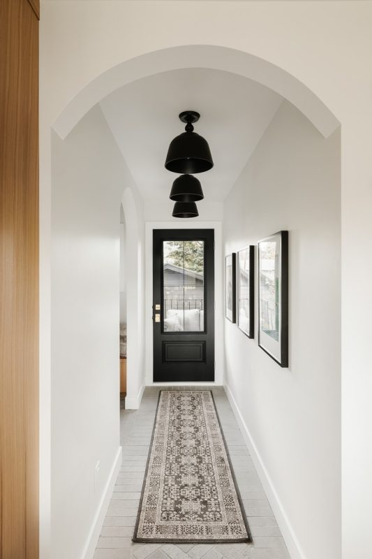
You don't need to paint the inside of your front door to match the other doors in your home. The repetition of the black pendants and artworks lead perfectly to the focal point of the black front door. This is a simple white hallway that has been taken to the next level with this tonal contrast.
Related: What should you paint on the inside of your front door?
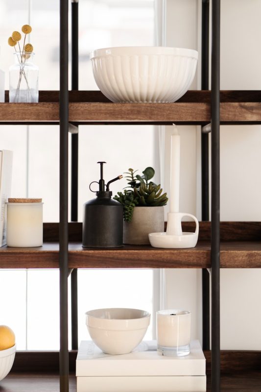
You should also consider how you work with tonal contrasts when you are putting together shelving displays. This shelf already has some nice contrast with the black and timber, but by adding lots of white, some more black and mid tone greys and greens, the effect is very pleasing.

Again, if you prefer to not have too much of a tonal contrast, you can opt for a light and airy scheme with mid tone timber, neutrals and white. The balance of contrasts works well here and there is also some really nice textures in the vignette.
Related: Kitchen Styling: My 5 top tips

I can't stress enough how important it is to put together a mood board when you are planning a decorating scheme. I have a free e-book in my Free Resource Library showing you how to create one. You can download it here.
I hope you have found this post useful and that it helps you to approach colour schemes in a new way.