
Styles come and go, as do colour schemes, but simple and elegant black endures. Chanel’s little black dress is the epitome of elegance and style, a look that has survived the years. Most famously worn by Audrey Hepburn and emulated by women for decades. This classic neutral is also a great colour for interiors as it adds strong tonal contrast to a scheme. Let me show you how to choose the right black.
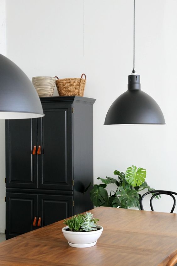
A touch of black for example in lamp shades or picture frames can be enough to make an elegant statement or you could take this further with some black painted furniture. Built in bookcases look particularly striking painted in black as the background recedes making the books stand out. This will work with any neutral from a warm taupe through to a green based ecru.
Tips on how to choose the right black
I am sure I don't need to continue with the benefits of using this great sophisticated neutral in your interior schemes, but as with most neutrals, selecting the right one is not always straight forward.
As with whites, beiges and greys, which are the staples of interior design, the colour black also comes in many guises and most paint companies offer a range that will have a slight underlying colour.
Of course, you can just opt for the paint manufacturers plain black, but often this is a little harsh and one that is slightly knocked back, can be more effective. I find that in interiors it is often preferable to use a slightly off-black as these are a touch softer. You still get the dramatic effect but they are slightly more understated and easier to live with, particularly if you are painting a full wall. My favourite paint options to help you choose the right black to use are:

ALWAYS view the sample on a large piece of card against the other samples of paints, fabrics, flooring etc. that you are going to use in your scheme to ensure that any underlying colour that is present works with your other choices. One of my favourite blacks to use at the moment is Colorbond Monument and you can ask any paint company to mix this for you. It is a truly great neutral as it is not as heavy and dark as a true black but also doesn't have any obvious underlying colour and is a great choice for interior and exterior schemes. It is one of my favourite front door colours which works for both sides of the door.
Related: What should you paint on the inside of your front door
Also consider whether you are using a striking contemporary palette with crisp whites and cool blues in which case your chosen black may have a blue base, like Dulux Domino or Resene Double Foundry. If however your scheme is a warmer, softer, classic one then Haymes Enigma, a beautiful soft black, may suit the look.
Remember that all of the options will have an undertone. This is the same as with white so you need to think very carefully about what you are partnering it with and ensure that the undertone is correct.
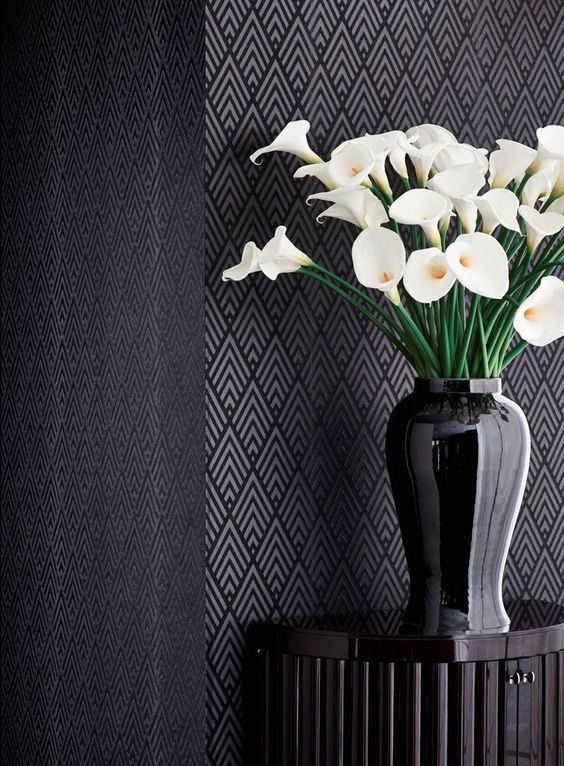
Wallpaper designs in varying tones of black and grey look very elegant as do soft furnishings in black linen or velvet. This is particularly effective as the darkness of the black is broken up and still gives you the wow factor and the dramatic mood for your room without the heaviness that a block colour will introduce. Soft furnishings as accents in this colour are very effective and classic pieces.
Using black to offer a strong tonal contrast
Use this strong dark neutral with pure white and you create very strong tonal contrast from the lightest on the scale to the darkest. This is a classic combination. Used below in this hallway it creates a striking effect and the crisp white ceiling prevents the darkness of the walls from becoming oppressive.
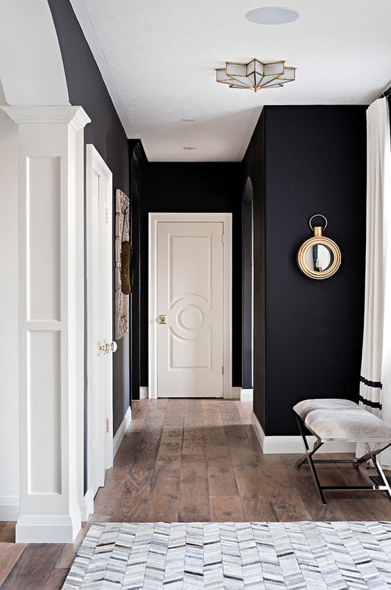
These walls are painted in Benjamin Moore's Black Onyx and I think look stunning but the space doesn't feel closed in as there is a large degree of white in the trim and interior doors.
Monochromatic colour schemes are a beautiful and simple look and a great starting point for those commencing on a colour theory journey. An all time favourite of course is the classic partnership of black and white – you can see lots of inspiration and read more here:
Related: Monochromatic colour schemes – Black and White
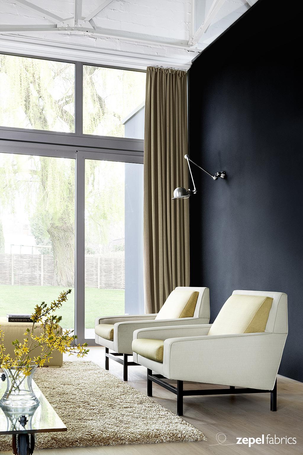
How to make a wall recede with black
Black is very effective to use on walls that you want to recede. By using any dark colour on a wall, you focus attention away from this area. This is a particularly useful tool to use if you have a great view as your eye is naturally directed outside. Furniture placed against a simple dark wall also stands out and again, this is a very handy trick if you want to draw attention to a favourite upholstered chair or sofa.
Related: Manipulating a space with colour – colour lesson 5
Introduce any of the metallics for a stunning scheme. A touch of gold here is very effective.

Consider the mood of a room when choosing black
The mood of the space will change dramatically with the introduction of a large amount of black into the scheme. Black can also be used very successfully with colour. A fashion statement this year is chartreuse, a lime green that is almost yellow. This colour is still popular for summer fashions and looks very fresh with pure white. It does however also look stunning when used in an interior with black and creates a very modern statement. You can simply introduce this with a modern touch of greenery.
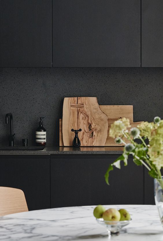
White marble looks great with dark cabinetry and creates a completely different look and feel to that which is achieved with white. As dark backgrounds recede they let other elements stand out and the gorgeous timber presentation boards in the image above really are the star here. Therefore if you like to style you will see the benefits of using this great colour as a strong background neutral.
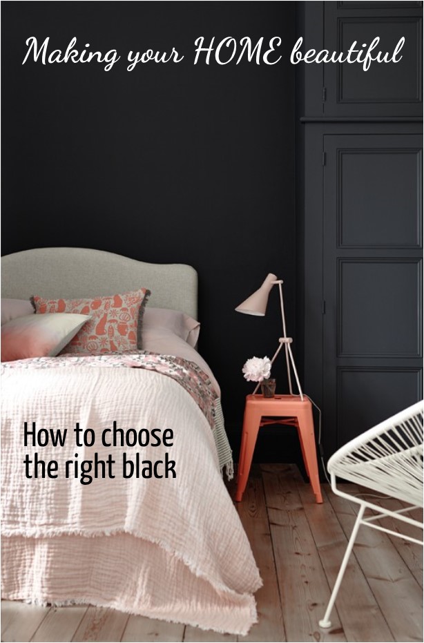
The room below is from The Little Greene Paint Company in the UK. I love the way the black background here makes the pretty bed the star of the scheme.
I hope that this has helped you to choose the right black for your next project. I have a Pinterest board dedicated to this colour where you can find heaps of inspiration.
If you want to read more you may also like these articles:
Related: Black bathrooms – how to successfully pull this off
Do you love the colour pink but feel it can be a bit sickly sweet? The answer is to partner it with a strong dark neutral:
Related: Let me show you how to use Pink, Black and White
When undertaking any renovation or decorating project you should put together a mood board. I have a FREE e-book in my Free Resource Library together with other checklists and e-books for you to download. You can sign up for FREE here.
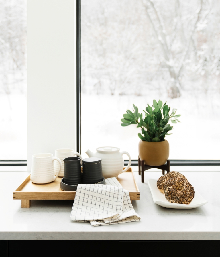
I love the look of the first photo so much! The black in it is such a nice contrast to the wooden finish of the table. I also love how it contrasts so well with the lighter paint of the walls. Black can be used in so many different ways, and it is easy to make black fit into any style of home. Whether you love modern or traditional looking homes, black seems to go with whatever style you choose!
These black and white designs are very creative and inspiring. Thanks for sharing.
Hi love the 7th picture with the timber boards placed on the bench . What colour black is that ?
I think that is a true black
Hi Sam, after reading your post on whites I have gone with White Cloak Half in my main living area, with Vivid White trims (with just a touch of brown tint for coverage). I have large French doors/windows that are 9m x 2m in height and have decided to paint just this black. The painter has done one coat of Domino and I am worried I’ve made the wrong choice! He’s happy to change it for me to a similar colour (best painter in the world), my question is, would you suggest Monument instead? The Domino seems harsh particularly when it’s dark outside, and perhaps also because it is such a big window. Thank you so much for your generous advice, your recommendation for White Cloak has worked beautifully in my house.
Hi Rita I would recommend Monument over Domino for your French doors – it is slightly softer and is very neutral – just a lovely off black/dark grey. Domino is a great colour but it is heavier and with an undertone of blue it doesn’t work in all environments. Glad you love the White Cloak! Thanks Samantha
Hi Sam,
Glad that I get to read this helpful tips after struggling so much to choose the right black for my main entrance door (1000mm). I always love the black and white color scheme, I am planning to paint my brick wall in Dulux vivid white and black entrance door and windows.
I am not sure which black should I use and should I use high gloss, semi gloss or met furnish for my entrance door?
Appreciate your generous advise.
Regards
Venus
Hi Venus You can just use straight black if you don’t have any other black or dark grey on the house – for example Colorbond Monument trim. In terms of the finish, high gloss shows more marks and defects in the door so if the door is very old then I generally recommend a semi-gloss or low sheen paint. High gloss will bounce the light around more and make the door appear lighter. Hope this helps
Hi Sam. I have exposed brick in my laundry area with the water pipes exposed. I would like to paint that area black mainly to blend the pipes in. The bench top is a Jarah and the rest of the area is antique white walls with the cupboard doors in Cake Batter. What black would you recommend? I am thinking Monument but would like another opinion please.
Hi Vanessa Monument is a great off black which is a bit softer than a true black and I find works well in this type of setting. You don’t see that it isn’t black until you put it next to a true black. Good luck Samantha
Hi Samantha,
Very helpful article – thank you. I am installing black aluminium windows / doors (thick frame) into our house and I am considering painting the surrounding brick walls Monument. I am concerned the contrast may make the walls look faded however I would like to avoid painting the bricks a pure black (like Night Sky, maybe Namadji?). I would be very interested in your thoughts.
Cheers,
Andrew
Hi Andrew there are other blacks you could look at as you will see a contrast with Monument. Namadji is a brown based black and the brown will show through. When choosing a black for outside you should paint a large board with two coats so that you can see the undertone. Good luck Samantha
Wanting a black to go with Dulux hogbristle. Does domino? I’ve used this colour previously in a different home and loved it
Hi Sue Dulux Domino is a great black. It does have a blue undertone which shows on exteriors in sunlight. This will work with the creaminess of Dulux Hog Bristle but I just wanted you to be aware of that. Good luck Samantha
Hi
I’d like to paint my front doors black however i don’t want a dark dark black. I wanted a subtle gentle black almost like a dark charcoal grey but am really scared that it’s going to look too black. Can you advise?
Hi Sheri Farrow & Ball Railings is a nice dark grey. They describe it as a softer alternative to black. The finish that you use will also make a difference with the eggshell giving you a more understated look than full gloss. Perhaps grab a sample of that to try? Samantha
Hi Samantha we are currently renovating the bathrooms. We are having Bespoke cabinets made that will be sprayed, can you recommend a shade of black, we don’t want a harsh black . Stone tops are white and polished chrome handles and knobs. Much appreciate the help.
Peter
Hi Peter it looks like you are in the UK – is that right? If so you should look at a sample of Farrow & Ball Railings. Samantha
Hello can you tell me a bit about the colour night sky in the colourbond range? I was thinking of painting my weatherboard this colour with white windows? My roof colour is woodland grey! Will this work?
Hi Sam Colorbond Night Sky is pure black – it will be quite a bit darker than Woodland Grey.
I really appreciate you showing me that not all black paint is the same. Learning this made me think about how we’re going to do a completely minimalist makeover for this place soon, and how these kinds of palettes will really work for that project. As soon as I find a residential painting expert in the area, I’ll definitely ask that they use these specific shades when helping us out.