
Warm whites, soft organic neutrals and delicate blush tones to offset and work with simple grey palettes are leading the colour trends for 2020.
With a foundation to the colour palettes of warmer softer whites with pink and orange based neutrals, the look is pretty and inviting. This isn't goodbye to grey, but a softening of the look.
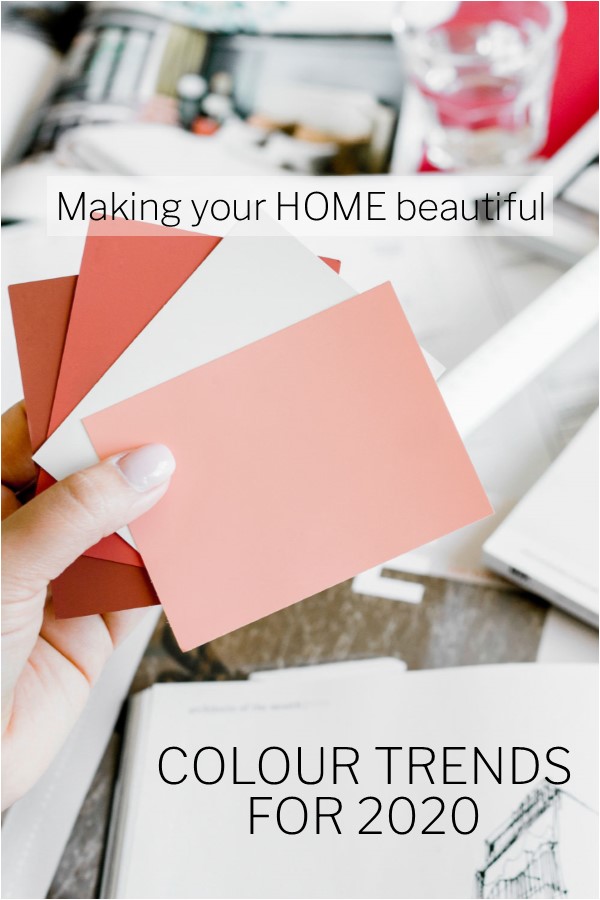
Here is my round-up of the colour trends for 2020
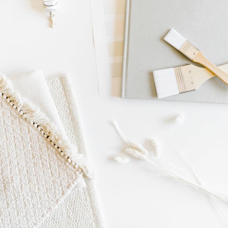
White is here to stay
White continues to be a firm favourite, but rather than shunning the warmer whites, which has been the case recently, you should be looking to these whites as they are taking centre stage. When you look at a small sample of a white paint next to a sheet of white paper you can see the undertone. This means the colour that the white is based on, which could be pink, yellow, orange, green or blue. Whites can also contain a degree of grey.
When viewed in isolation, people can get freaked out by the amount of creamy yellow or pink that they see but what you need to bear in mind is that this may be exactly what your home is crying out for. I won't go into selecting whites in this post as I have some great in-depth articles on choosing whites, but what I would stress, and what the colour forecasters are seeing, is that warmer whites shouldn't be discounted.
Here are some of the whites that are on trend for 2020.
- Dulux Natural White – an absolute best seller and classic in the Dulux range. With a hint of warmth, this white is a great all-rounder.
- Dulux Casper White in quarter and half strength is a grey white with a slight pinky/blush undertone
- Haymes Marble Mist is a very pale soft fresh white.
- Taubmans Ice Cream is a classic pale warm white, described by Taubmans as a stone white, this will give you warmth without an obvious yellow undertone
- Resene Eighth Spanish White
Related: 5 mistakes to avoid when selecting white
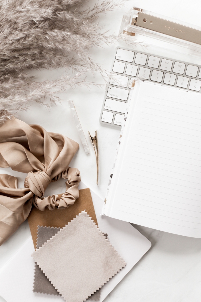
Warm Neutrals are on trend
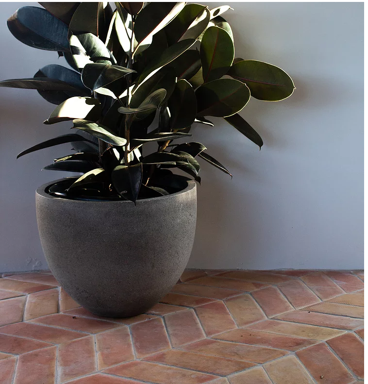
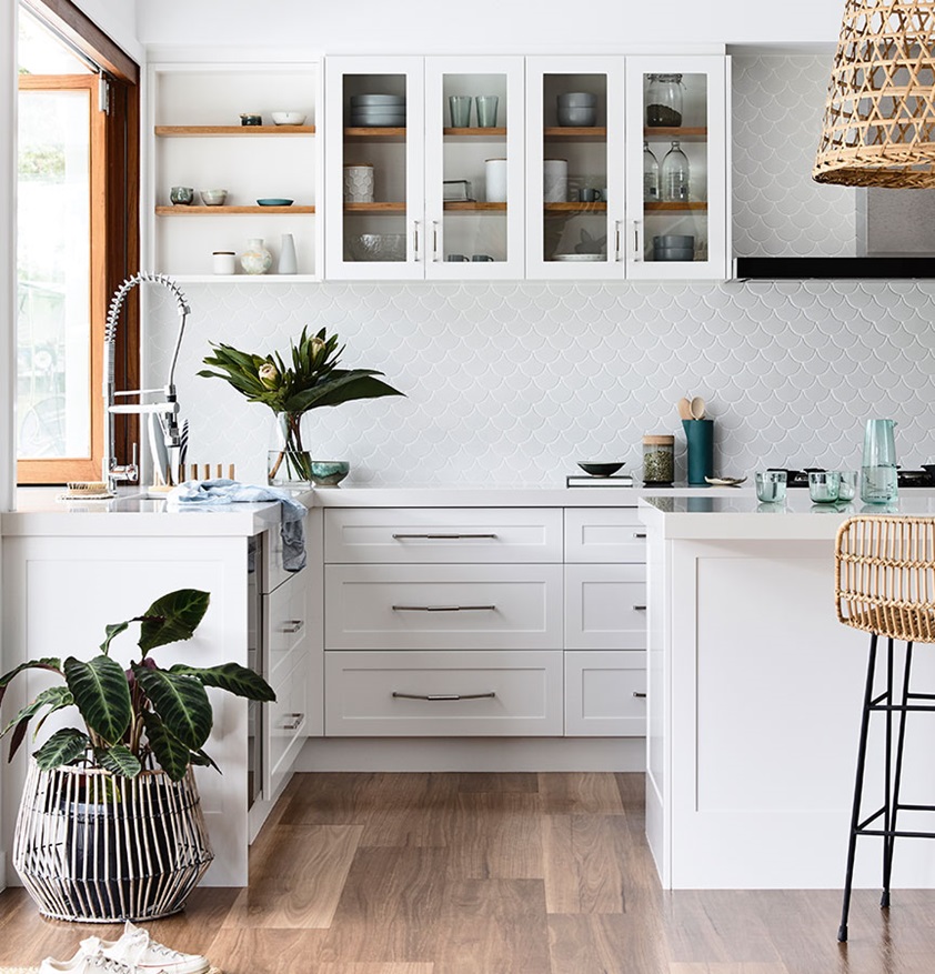
When reviewing the colour trends for 2020, the neutrals that are coming to the forefront are ones with warm, golden undertones. Warm, honey coloured timbers are popular to offset the range of greys being used in homes. Soft, weathered Terracotta floors are back on trend and all the more popular if they are aged and mellow.
These gorgeous rich warm tones of Caramel and Biscuit are the perfect accent to a simple grey and white palette. Rather than adding cool blues and more grey, by adding a touch of warmth, the grey somehow comes more alive.
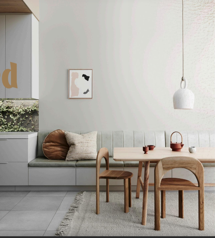
You can see this in the image below from Dulux. Grey Reflection has been used on the walls with a simple grey floor tile and similar colour rug. However, by introducing some warm, honey coloured timbers, some terracotta coloured accessories and a simple caramel coloured cushion, the overall feel is one that is right on trend, but also welcoming.
Dulux call this their Grounded trend and I think it is very effective.
Some of my favourite on-trend neutrals are:
- Dulux Beautiful Beige – a mid-tone warm neutral with a touch of grey to keep it sophisticated
- Porters Old Stone Wall – a lovely warm mid-tone grey
- Resene Blanc – explore the tones from eighth strength through to triple strength
- Haymes Whitewash – from 1 through to 7
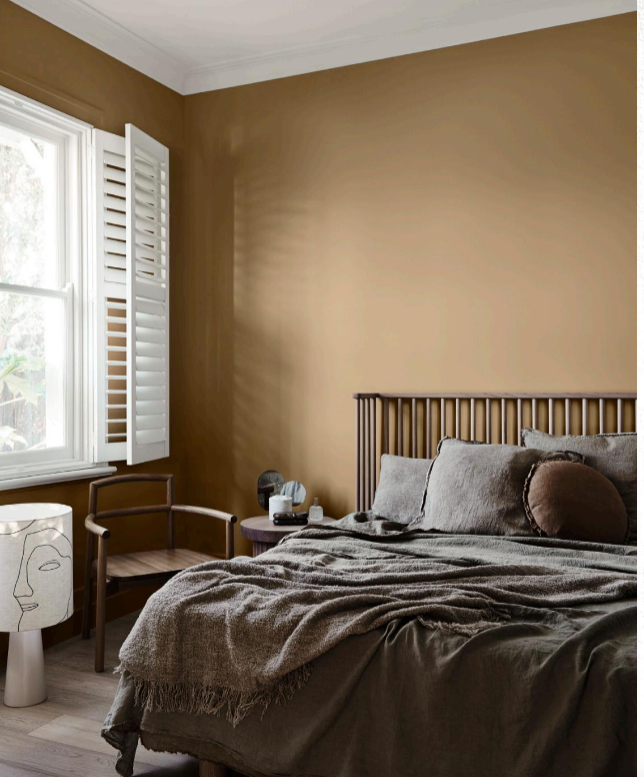
The bedroom above is from Dulux and is painted in Fantan with a Natural White ceiling.
Related: Let me show you how to use Terracotta
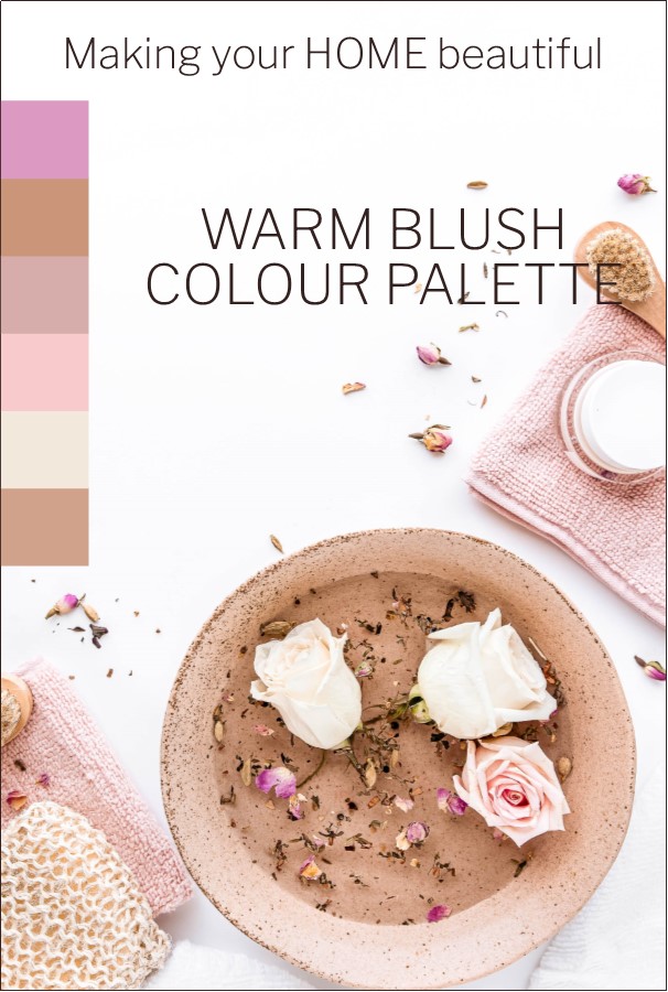
Blush Tones are a big part of the colour trends for 2020
Caesarstone has brought out a warm pink in their ultra modern rough, low reflective surface which is certainly a sign that colours are getting warmer. Topus Concrete will soften interiors beautifully and I can definitely see this taking hold in commercial settings.
Benjamin Moore in the United States has named their colour of the year for 2020 – First Light. A soft and pretty pink which is being introduced throughout the home.
I have written a lot about pink over the last few years. Millennial Pink has been popular for a while and it is so good to see this colour being recognised by one of the leading US paint companies.
Generally pastel tones are on trend, which with our love affair with white makes sense. All pastels work together because they contain a huge degree of white. By using pastel tones in your decorating schemes you can safely introduce some colour, while keeping the mood light and airy.
We have certainly seen a return to pretty in the fashion stakes. Just take a look at the dresses at the Flemington Races recently. There was a gorgeous sea of colour with pretty floral designs everywhere.
These soft blush tones relate so well to our interior schemes as they provide an environment that is welcoming, loving and safe. This isn't something we automatically see but it gives you a general feeling of wellbeing.
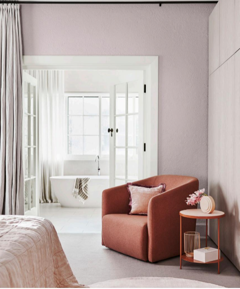
I have put the colour palette below together to demonstrate the 2020 colour palette which I see taking hold during the year. You don't have to paint your walls pink but by using a soft warm white with some caramel coloured furnishings and some soft pink accessories, you will have a very welcoming room.
Related: How to decorate with pastels
On-trend finishes for 2020
Natural matt finishes continue to be at the forefront of design. Joinery and paint finishes are ultra matt, or satin at the most, with gloss rarely being a popular option. While we will see natural timber elements being offset by whites and greys, again with a simple matt finish. The cabinetry below is a Laminex satin finish.
The trend for authentic individual pieces of furniture and accessory items that tell a story, continues to be a popular theme. Our love of Scandinavian style that places importance on craftmanship, with pieces that have been beautifully designed, demonstrates this point perfectly.
Related: How to Hygge
Colour trends for 2020 see elements of black
Touches of black are also on trend. Furniture and mirrors in black metal evoking an understated Moroccan Boho vibe are being introduced into interior decorating schemes. The trick is to not overdo it and ensure that the odd exotic piece is nestled amongst favourite antiques and more mainstream pieces.
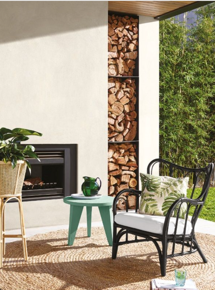
Green continues to dominate
Our love affair with all things green continues to be an important element of decorating for 2020. Whether it is a large statement plant or an Emerald green velvet sofa, this colour is always in the mix. Dulux feels this is our desire for slow living and cultivation. Whether we have our own veggie patch or a few pots of herbs on the balcony, greenery is here to stay.
There is no doubt that this colour makes us feel good. The eye doesn't need to adjust to see green so it is a very relaxing and comfortable colour to live with.

Related: How to incorporate the greenery trend
Will you be embracing the warmer whites this year or are you brave enough to incorporate some blush tones into your decorating palette? Or are you going to lean towards the gorgeous greens of the spectrum?
Whichever way you go, remember that grey is still popular, white is here to stay and natural timbers, flooring and finishes are the order of the day.
If you need help with a decorating project you should make use of my FREE Resource Library and if you are stuck with selecting colours, you may like to check out my e-consultation service.
Thankful for sharing this useful post!