
Colour, Interiors, What to paint where
How to use a strong feature colour
All white interiors are certainly popular, but I am hearing more and more from clients that they would like to introduce some colour. In fact, they are craving some more colour but are completely unsure of how to achieve this without compromising the look of their home. Using a strong feature colour can be daunting, particularly if you use it for joinery, which can be expensive to change. Clients also are concerned about resale value of their homes. Therefore, many take the safe route of decorating with whites and neutrals.
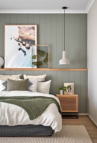
Let me say that I am not necessarily a fan of a traditional feature wall. That is selecting one wall in a room to paint a different colour. There has to be a good reason to make a feature of one wall only and this is something that takes a lot of thought and planning. The sage green feature wall in the image below makes sense. It is the backdrop to the bed but is also in a different substrate than the other walls in the room. this works beautifully.
In this post I am going to show you how to use a strong feature colour without compromising the look of your home.
What do I mean by a strong feature colour
In an all white or neutral interior, just one pop of colour will create a strong focal point. I'm not talking about adding colour through the house, but restricting it to a couple of areas. You know the saying, less is more, this can be the case here. It's also not a main background colour as you would have if you painted all the walls.
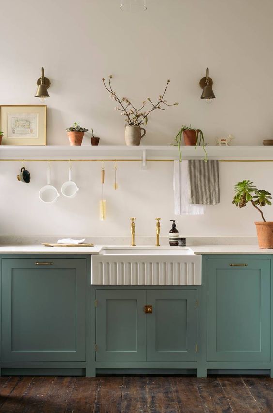
Feature colour for an island bench
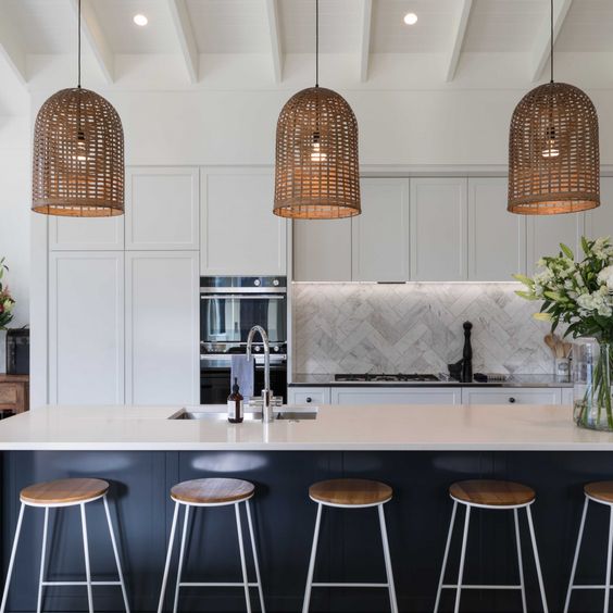
This is one of my favourite ways to introduce a central feature colour. The island bench below is painted in Resene Cinder which is an almost black with an undertone of blue. When I use colour on an island bench, I like to use it for the entire bench rather than just the panels facing out to the living/dining area. I feel this gives more balance to the look and really makes it a feature in the kitchen as a whole.
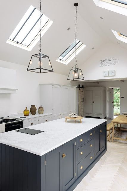
If you would ever like some inspiration and a lesson in how to use colour in kitchens, you should look no further than DeVol Kitchens. Their designs and use of colour make me swoon.
Related: Have you considered using blue for your kitchen cabinets?
Another gorgeous DeVol kitchen featured in House and Garden UK. The colour is DeVol's own Trinity Blue which is a gorgeous Duck Egg Blue. Used for the entire kitchen, this is a real colour statement but it works as the rest of the home is fairly simple with a soft neutral on the walls.
Related: Let me show you how to use Duck Egg Blue and Have you considered green for your kitchen cabinets?
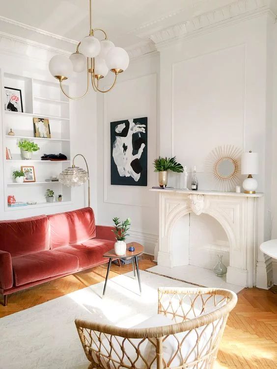
A strong sofa colour
When I taught short decorating courses at a college many years ago, a student asked me whether she could have a red velvet sofa in her living room. When I told her she most certainly could she gave me a huge hug. She just wanted that affirmation. I talked her through how to achieve this and make it work. Basically, don't overdo the red in the room. Keep the sofa as a statement and use some other strong tonal contrasts, for example some dark greys or black with white. Or rich dark browns with a range of other neutrals. Consider the style of the room and the mood you want to create. Red with black and white is bolder and more contemporary than red with rich browns and greige tones.
The Parisians do this look really well. In their white and grey apartments, they will introduce a funky hot coloured sofa, which works as everything else is so neutral and simple.
Related: Parisian Style – 7 steps to achieve this look
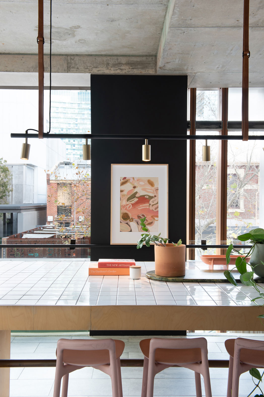
A feature colour as an accent
Generally, a strong central colour would create more of an impact than a traditional accent colour. However when rooms are all white or neutral, even an accent of cushions can be enough to create some strong interest in a scheme. It's also a great way to start with introducing colour.
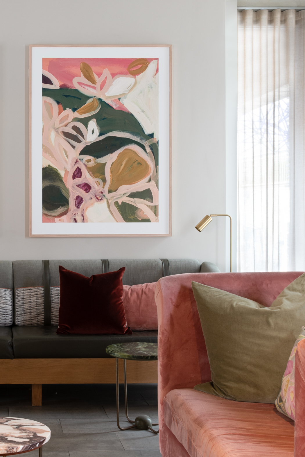
The colour in the artwork below has been enhanced as it is against a dark feature wall which is a statement in its own right. The addition of the colourful artwork here has really made an impact and means that the dark wall is highlighted.
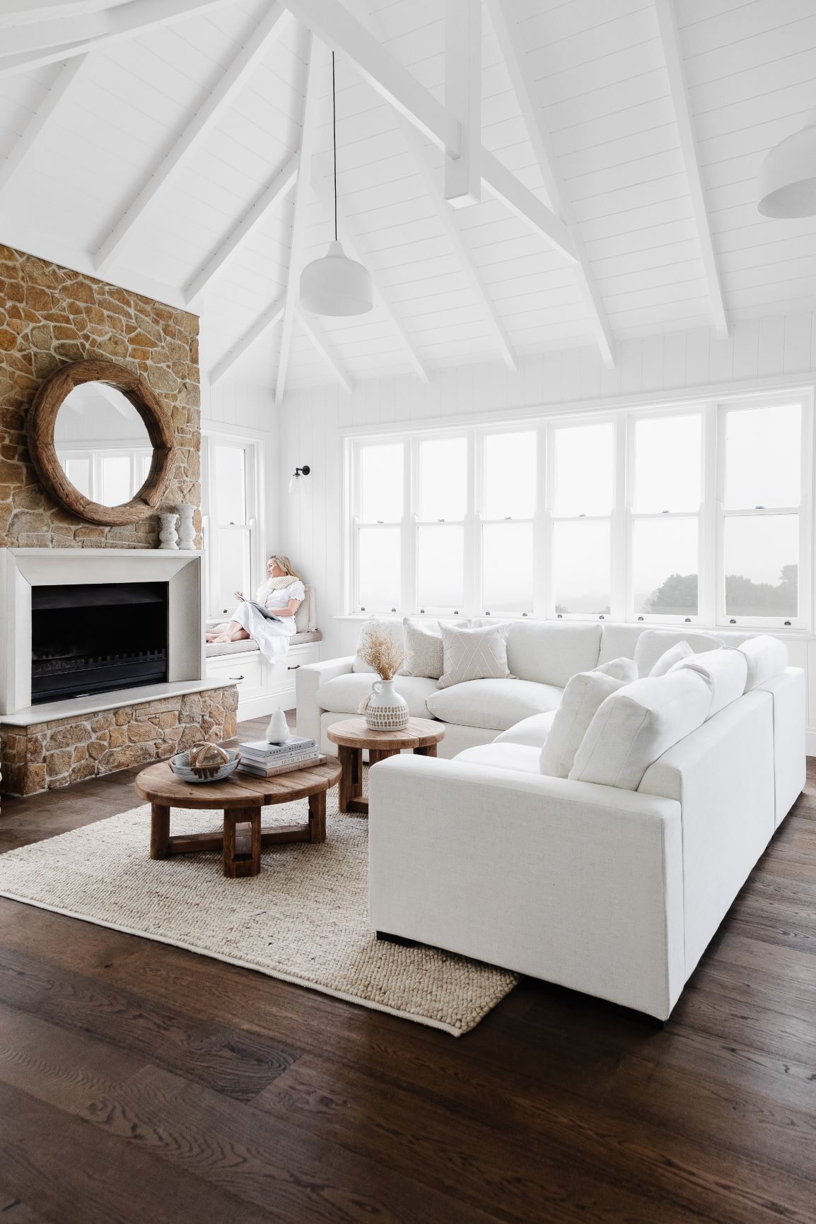
A natural feature colour
Don't assume that a feature colour has to be provided by paint or fabric. In a room that is all white, a stone fireplace makes a magnificent feature. Remember that a feature is something that the eye is drawn towards. This is why these gorgeous natural stone fireplaces work so well in all white schemes. They ground the scheme and focus the eye.
Avoid a spotty look
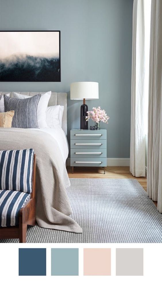
Don't choose a colour that you love and then use it all around the room. Remember, a strong central colour has a lot of power and if you use it too much, you dilute the impact and create a spotty effect. So don't decide upon one colour, for example red, and then use it for cushions, vases, rug, artworks etc. Make an impact in one part of the room, for example with cushions only or a statement artwork or even a red velvet sofa. This gives you the richness and appeal of strong colour but as a statement rather than a spotted effect.
You can successfully use different tones of one colour. The gorgeous, restful bedroom in the image below uses blues from inky, almost black tones through to a soft pale grey blue.
If you would like to use more than one colour, choose a main statement colour and then for other colour in the room, use either a complementary (opposite on the colour wheel) colour or a related (next door on the wheel) colour.
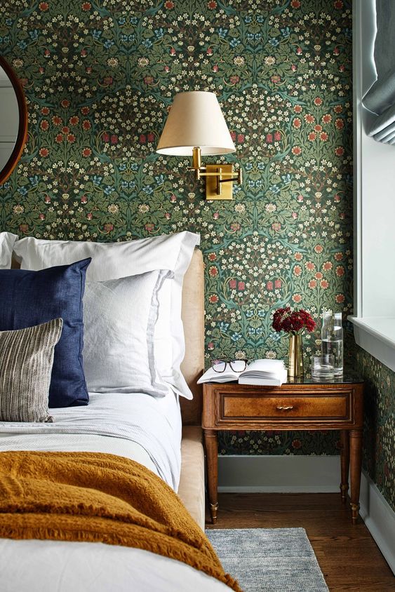
In this gorgeous bedroom from designer Zoe Feldman, green is the statement colour. The blue and yellow in the scheme sit either side of green on the colour wheel and pull out these hues from the wallpaper design. If you are confused about colour, remember that very talented textile designers have already done the job for you in their gorgeous designs. Therefore, you can opt for a statement feature like this and pull out the other colours for accents in the space. The accents should be just that though so that they don't compete with the main colour.
In conclusion
- A feature colour can be strong and dominant but remember to just ensure that it is a feature. Don't forget the less is more mantra.
- Give consideration to where and when you use a feature wall. Ask yourself if its placement will enhance the room, or are you just using it because you feel you should?
- Feature colour can just be introduced in a small accent as cushions or a throw.
- Features don't have to be a strong colour statement, a stone fireplace in an all white room is a stunning feature.
- Blocks of colour are more effective than lots of colour dotted around a space.
- If you do want to add further colour, introduce these as accents and consider how they relate to the main colour.
I have lots more to tell you about colour if you're interested in how to put different schemes together:
How to choose colours – lesson 1
Related colour schemes – lesson 2
Complementary colour schemes – lesson 3
If you're building or renovating or just embarking on a weekend decorating project, I have a FREE Resource Library with comprehensive e-books and checklists to help you. You can sign up for FREE here.
Love your blog Samantha. I was hoping you could help me out. We need to repaint the exterior of our home. We have a federation red brick house and a slate roof at the front and a Woodland Grey roof at the back where we added on. At the moment the down pipes, window sill valance, barge board and front shutters are painted in Woodland Grey as is the garage door. The front door is in Domino. The Gable stocco, batons on gables are painted in stonewall by Resene as are the window architraves and timber brakets on the verandah including the side verandah door architraves. The Eaves and Soffits are painted in Winter Haven. My husband would like to introduce a different colour on the batons on the gables and also the garage door. That door looks like a barn gate door with batons. He would like to pick up some of those batons as well in a different colour. What are your thoughts on the existing colour scheme or should we change some and yhour thoughts on picking out the batons with a different colour? Many, many thanks for this Jen
Hi Jenny It’s difficult to say for sure without seeing the house but the scheme sounds good but I do think that if you picked out the batons in the gable that it could look better – not sure about the garage door too as I would need to see it and you need to ensure that the house doesn’t end up looking too busy. Hope this helps Samantha